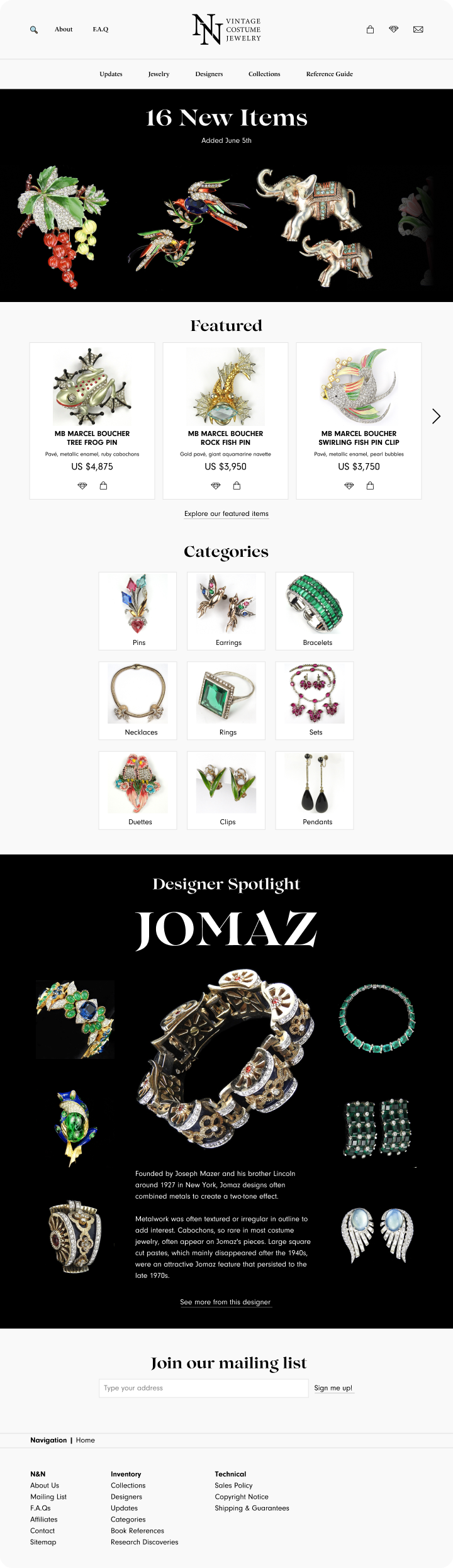
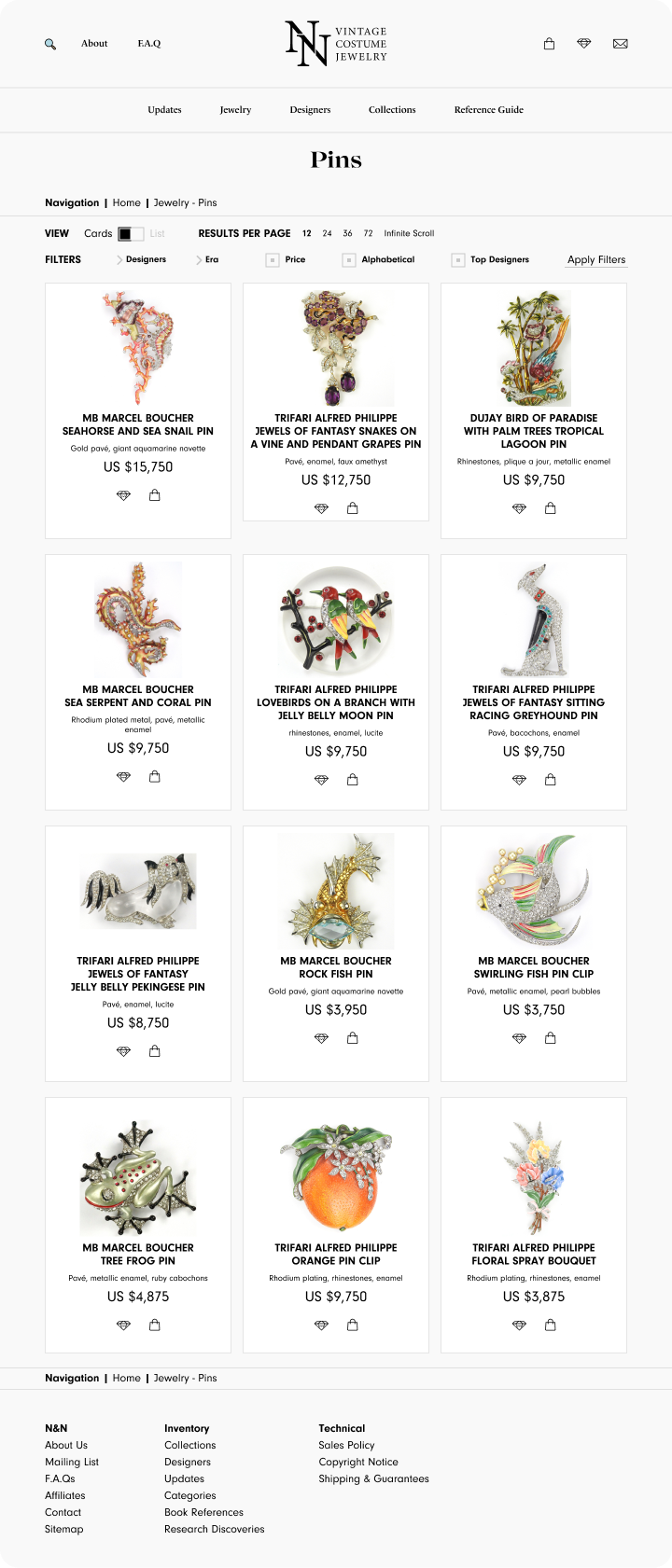
N&N Jewelry's e-commerce website was first created in 1999, and over 20 years later, it still had its original Web 1.0 design.
The Challenge: Redesign N&N's graphics and UX without alienating long-time users, while reducing visual clutter.
The Users: Collectors (casual and specialized); casual consumers who purchase costume pieces for enjoyment and daily wear; as well as merchants who distribute N&N in other markets (e.g. New York).
The Limits: A strict timeline of 2 weeks, limited budget for research, and only vague details on the scope of the project.
The Results: Final studies found the site redesign enabled a 30% higher clickthrough rate from users and a 50% increase in time spent on each page vs. the original. Company stakeholders are in the process of implementing these designs.
The stakeholders and myself discussed key metrics for the redesign, identified problems and KPIs to measure the redesign's success.
Web traffic was down as a result of being rated low by Google's PageRank. N&N needed to implement responsive design to remedy this.
Average time spent on each page: Low on each page and in general throughout the site.
User to customer conversion: Of course, as an e-commerce business, this was N&N's ultimate goal.
Better clickthrough rate: N&N's inventory is updated on a weekly basis on a dedicated webpage and through an email newsletter.
The effort put into these updates needed to be reflected in the clickthrough rate, both from the newsletter and through the front page .I needed to make goal statements to account for the different users who would be visiting N&N's website. With such tight deadlines, journey maps and user personas were not feasible.
Missions:
As a Jewelry Collector, I want a clean, easily navigable site so I can find pieces and designers fast.
As a Casual Customer, I want to discover costume jewelry and make informed purchases.
As a Merchant, I want to be able to get in touch with N&N to conduct B2B transactions.
Without a budget for user research, I looked into UX insights through a comparative analysis.
I hypothesized that business structure, user experience, and demographics would be key to an insightful analysis. I decided that rubylane.com would be an effective foil to N&N, given its popularity as a vintage jewelry retailer and the stakeholders identifying it as a main competitor. What follows is a condensed version of that analysis.
What I looked for:
• Business model
• Information architecture, navigation, whitespace, ease of use
• Target demographics
rubylane.com
In brief
Ruby Lane hosts merchants and allows users to create their own profiles, to become either sellers or buyers.
As a platform for user-generated content, it sells jewelry of all kinds, with a dynamic database of pieces.
Business
• Monthly maintenance fee to sellers
• 10% service fee on items sold
UX
• Too much whitespace
• Loosely organized
• Photography is of inconsistent quality
• Pieces may be wrongly identified and prices inconsistent
• Responsive design
Demographics
• Casual consumers
• Collectors looking for a 'diamond in the rough'
trifari.com
In brief
N&N is a centralized seller with a 4000+ item inventory, with premium prices.
Its pieces are organized by jewelry type, decade, designer, or object depicted, paired with a powerful search function.
Business
• Direct business to consumer
• Google ads
UX
• Cramped, and not enough whitespace
• Highly organized
• Photography is uniform and high quality
• Pieces are well researched
• Lack of responsive design
• Easy to navigate
• Web 1.0
Demographics
• Specialized collectors
• Casual consumers
• Merchants
N&N has a strong base for attracting users given a design refresh; its core business is effective and profitable. Additionally, Ruby Lane does not have a compelling competitive advantage over N&N for them to seriously reconsider their business model.
N&N does however need to reconsider its lack of whitespace, the design system it uses, and its web responsiveness.
Through consultation with stakeholders and with existing customers, I realized that N&N's information architecture was not getting its message across. The front page did not showcase any jewelry pieces by default; the emphasis needed to be on the merchandise.
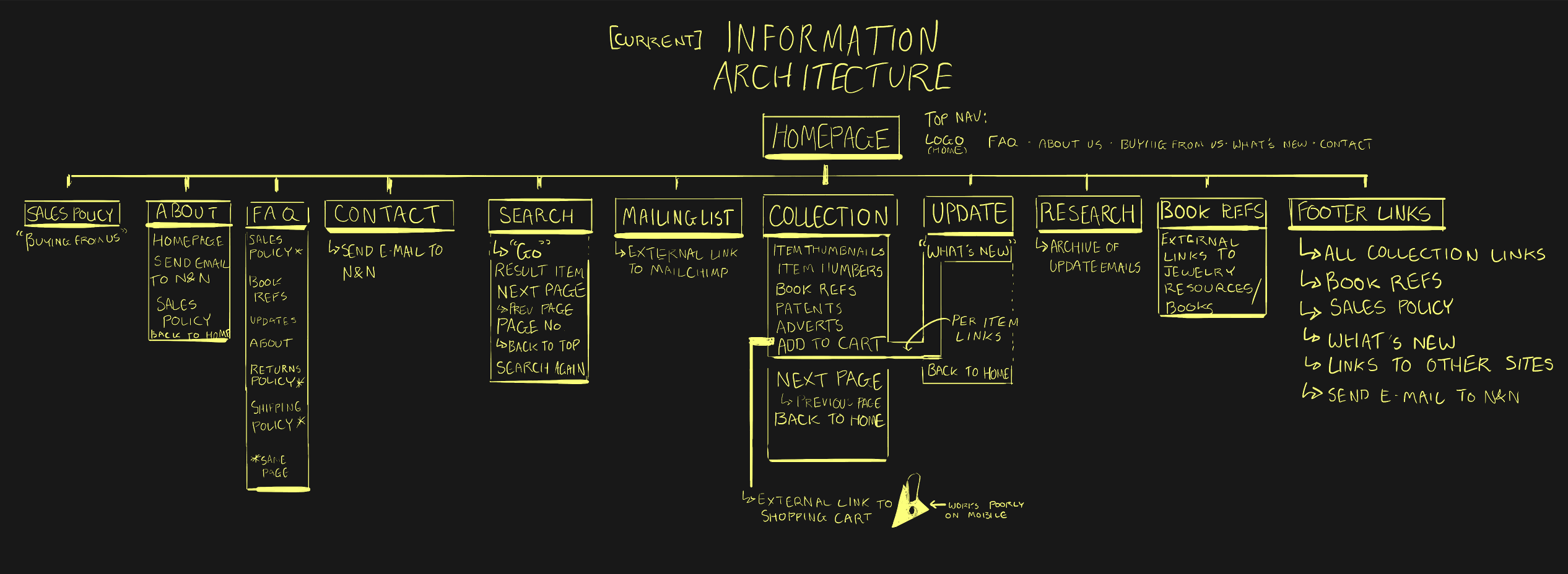
N&N's website has a relatively shallow information architecture, with some duplicated links as redundancies.
In redesigning, the goal was to take this information architecture and give the user more information and content without clicking.
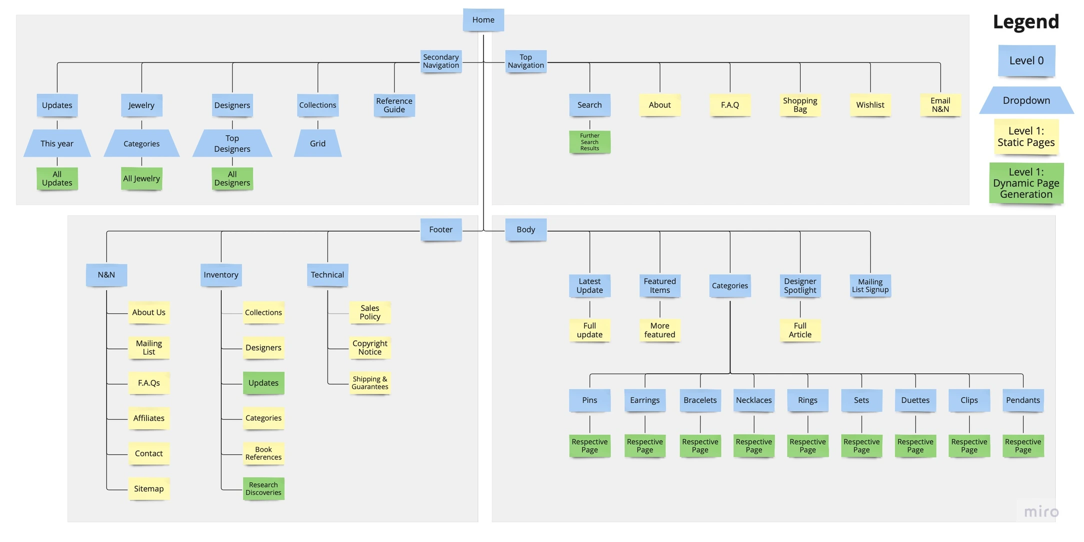
The new map keeps the product front and center, and just like the original, all parts of the site are accessible from the first page.
Given the departure of the redesign from the existing brand, stakeholders expanded the brief to include a brand refresh, including typography, palette, and stationary.
Through sketching and research, I had an idea of how to bring N&N into the 21st century. Cross-referencing with luxury jewelry retailers like Tiffany, Swarovski, and Chanel, I set about re-styling the N&N brand.
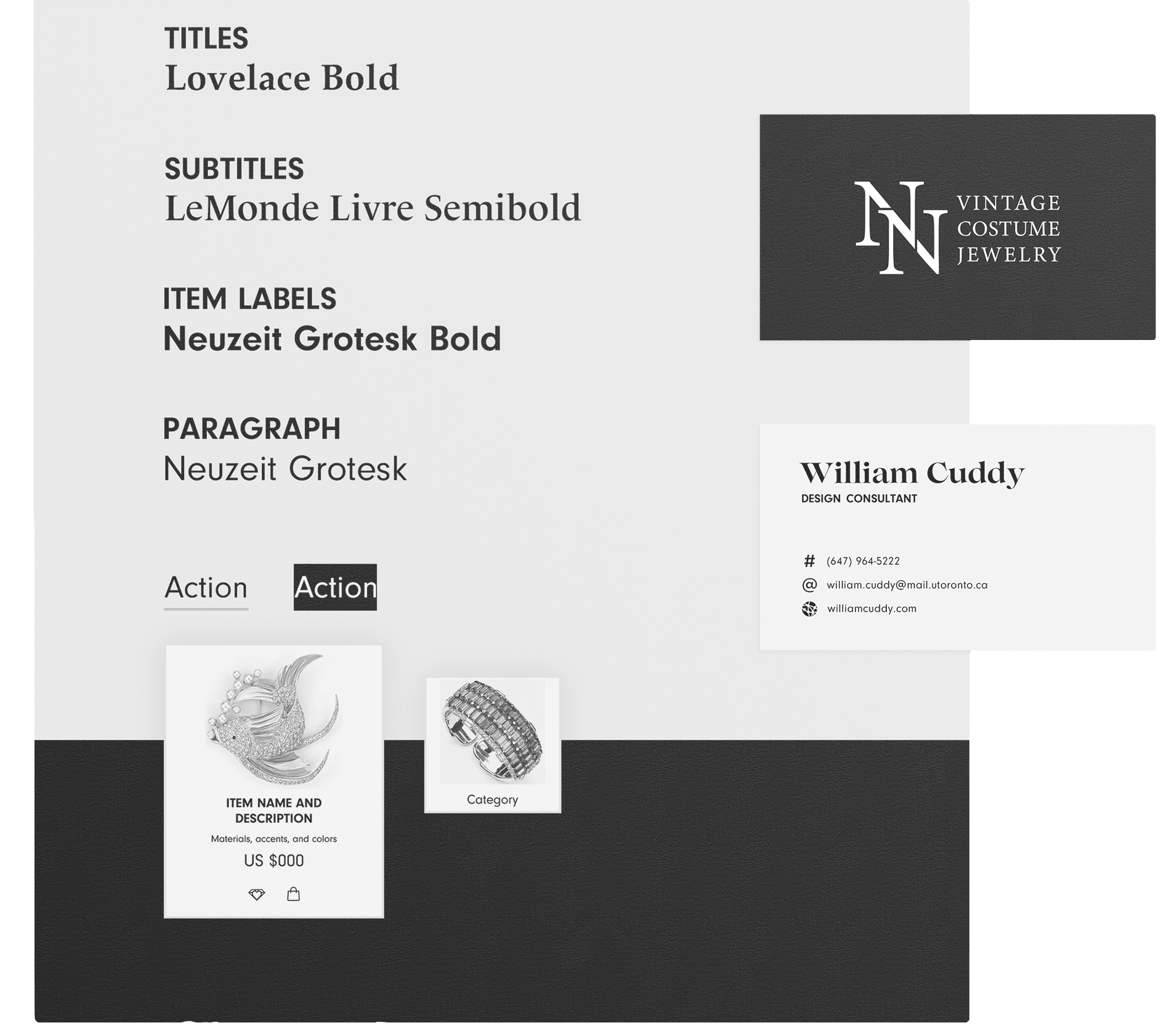
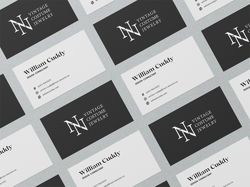
The stakeholders wanted new stationary to fortify the brand when doing in-person networking, and so I created a new business card design.
With a new brand identity in place, the next step was to create a mockup of the redesigned website for stakeholder consideration. Some time after the redesign and brand refresh were completed, stakeholders had the capacity for user testing and further research.
The resulting increase in clickthrough rate and time spent on page satisfied two of our KPIs - further indicators to be worked on at the stakeholders' discretion.
THANK YOU
FOR READING